Pivot Table
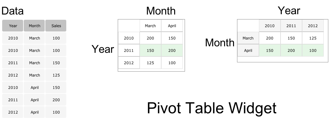
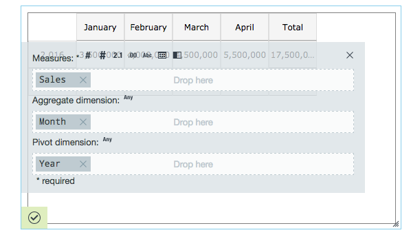
Creates a pivot table. The pivot table consists of rows (pivot dimension), columns (aggregate dimension), and data (measurement) fields. Among its many uses, it can automatically sort, count, and total the data stored on a sheet and displays the results in a table.
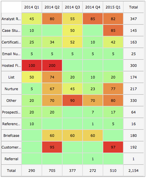
Pivot table with using heat map.
Configuring the Pivot Table with Data
Here you can find out what kind of data can be represented as a pivot table and what options you have to represent your data. General steps for configuring widgets are explained on the Visualizing Data page.
Data Requirements
You can use any Datameer supported data type in a pivot table with data.
Appearance-Specific Settings
The appearance of a pivot table can be adjusted through standard and specific settings.
Standard widget settings give you basic controls in order to customize a widget. Learn more about standard widget settings here.
Specific widget settings give you more controls over details pertaining to the pivot table widget. With these controls, you can adjust your widgets to create the perfect infographic to fit your needs.
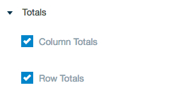
Totals
Select to total your rows and/or columns.
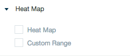
Heat map
Select to add a heat map or design a custom range in your widget.
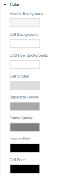
Color
Color settings let you adjust the color aspects of the widget. Use the color wheel by clicking in a color box and selecting the color to add to these spaces.
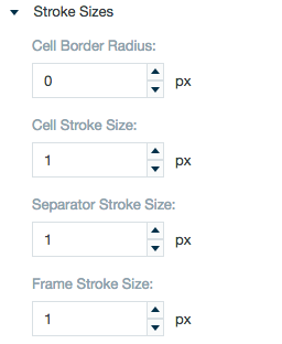
Stroke sizes
Adjust the sizes for the lines that make up and separate cells in the table.
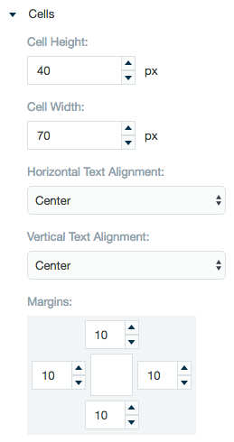
Cells
The cells setting allows you to adjust the height and width of the cells as well as alignment of the text within the cells. Use the margin adjuster to perfectly position the widget within the frame.
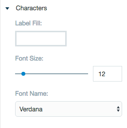
Characters
Adjust font size and choose a font type.
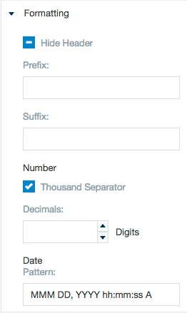
Formatting
Formatting settings give you controls to add pre/suffix to labels, hide the column names, add in a thousands separator for data, specify the number of decimal places to show, and set a data parse pattern.
