Types of Infographic Widgets
Widgets allow you to visualize different types of relationships between your data. You can find a percentage, portion, or share; view data by geographic region; or see how it ranks or compares with other data. You can also see trends and whether they increase or decline.
Consider using an action statement as a heading and then think about the verbs you would use in that statement to help suggest a chart type.
Widget Reference
The following sections describe the options available in each widget.
For an overview of several chart types and their uses, see http://www.sapdesignguild.org/resources/ma_guidelines_3/interaction/graphics.html
http://www.mindtools.com/pages/article/Charts_and_Diagrams.htm also has some good general information about graphs.
You can also look up information on visualizing data by Edward Tufte.
Customize Widget Settings
Standard and widget specific customizations are available for each of the widgets Datameer offers. These settings allow you to completely modify infographic widgets to create the perfect visualization for the data being presented.
Standard settings
Standard widget settings give you control of basic details. A description of the widget is given and you are able to make changes to the background/frame colors and positioning of the widget. Adjusting the amount of data being presented and the opacity is also an option for each widget.
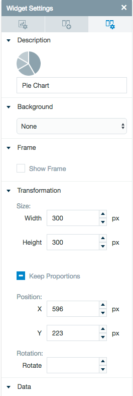
Specific settings
Specific widget settings give you more controls over details pertaining to the individual widget being used. With these controls, you are able to adjust your widgets to create the perfect infographic to fit your needs. Check out Datameer's different widgets to learn more about the specific settings of each.
Infographic Widgets and their Uses
There are different types of graphs and different uses for them. This is an overview, to find out more about the individual widgets, click on the links.
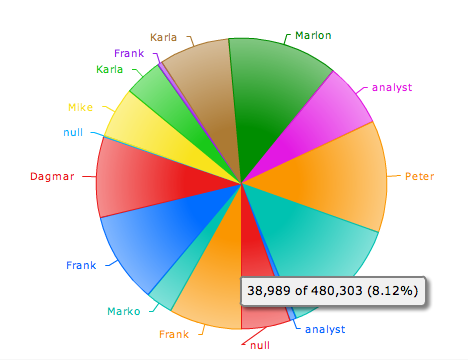
Pie Chart
Creates a pie chart. Pie charts can be an effective way of displaying information when the intent is to compare the parts to the whole, rather than comparing the slices among themselves. They are more effective when the slices represent 25 to 50% of the data. If you want to find out percentage, portion, or share, you might want to use a pie chart.
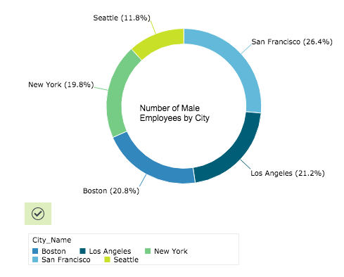
Doughnut Chart
Creates a doughnut chart. Doughnut charts, similar to pie charts, can be an effective way of displaying information when the intent is to compare the parts to the whole, rather than comparing the slices among themselves. They are more effective when the slices represent 25 to 50% of the data. If you want to find out percentage, portion, or share, you might want to use a pie chart or doughnut chart.
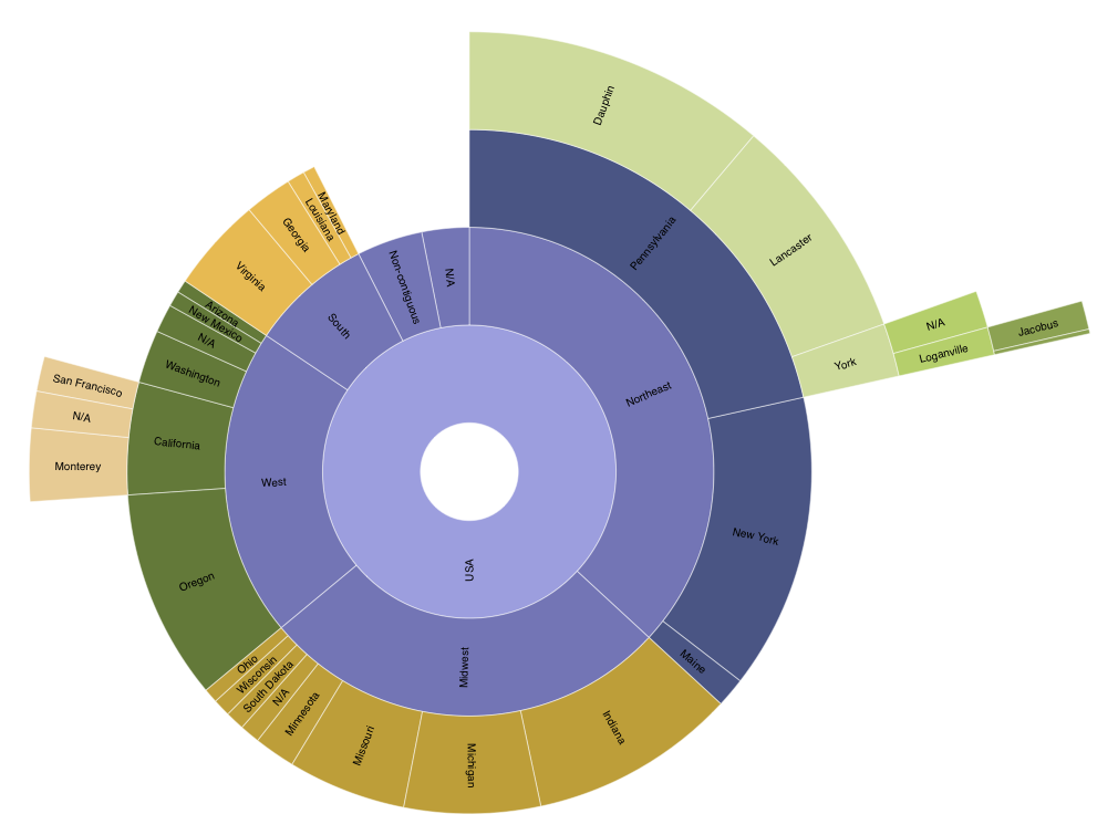
Sunburst Chart
A sunburst chart shows the hierarchical nature of a dataset similar to a treemap, except that it uses a radial layout. These charts are a variant of classical node-link diagrams. The root node is located in the center, the position of nodes compared to each other shows their rank in the structure's hierarchy. The size of each node is determined by a value present in the workbook that you choose.
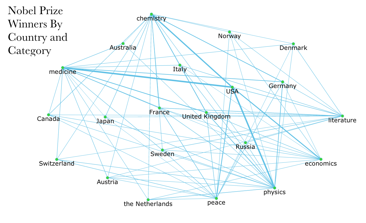
Network
Creates a Network diagram. A network diagram is a visual representation tool that connects source data to show its relationship to the target data.
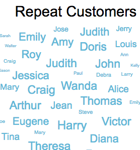
Tag List
Creates a tag cloud or word cloud. A tag cloud is a visual representation for text data, typically used to depict keyword metadata on websites, or to visualize free form text. This widget can be used to visually evaluate text according to weight and frequency.
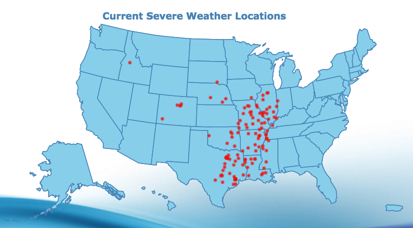
Map Widget
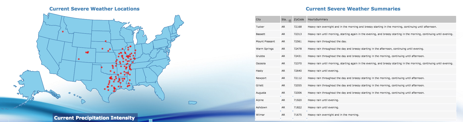
Creates a map chart which can be used to analyze data linked to a geographic location. For example, you could map earthquake data such as magnitude vs geographic location. It can be used for resource management, asset management, marketing, and other purposes. If you want to show data broken down by country, county, or state use a map.
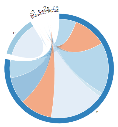
Circular Network
Creates a circular graph. These are useful when visualizing the interdependencies of two elements - to see how often they appear together. If the two elements are linked, then there is a line joining the two nodes (datasets). The thickness of the line shows the number times the nodes are joined. This graph doesn't show the direction that information flows, however. By highlighting a node, a list of connections appears.
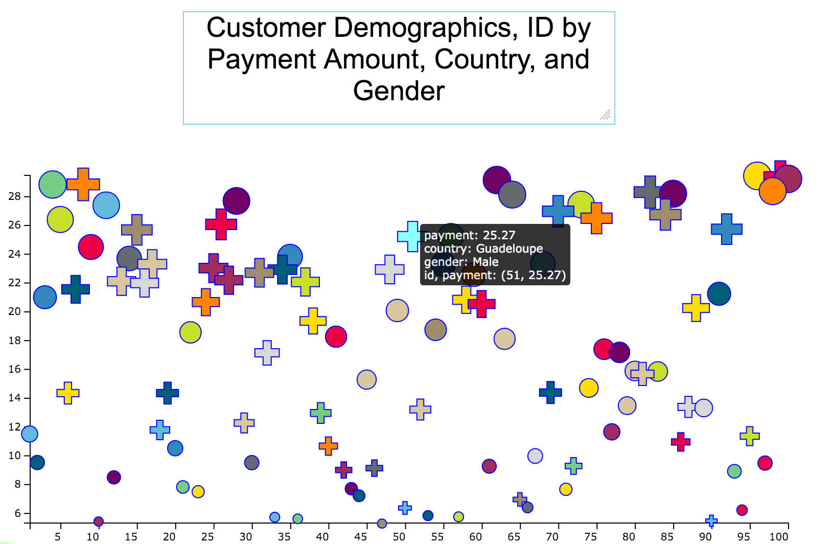
Categorical Scatter Plot
Creates a scatter plot the can also measure categorical data. The entities displayed on a scatter plot can be compared in terms of their size, their relative positions with respect to each numeric axis, their color, and their shape. Since both the x and y axes of the scatter chart are numeric scales, position is an indicator of two distinct numeric values. The color and shape of the entities shows their categorical values. The area of the plot depends on the magnitude of a third numeric characteristic. Scatter charts can be used in project management to compare risk and reward among projects. They can facilitate the understanding of social, economic, medical, and other scientific relationships. You can think of them as performing a visual square-root transformation on the data set.
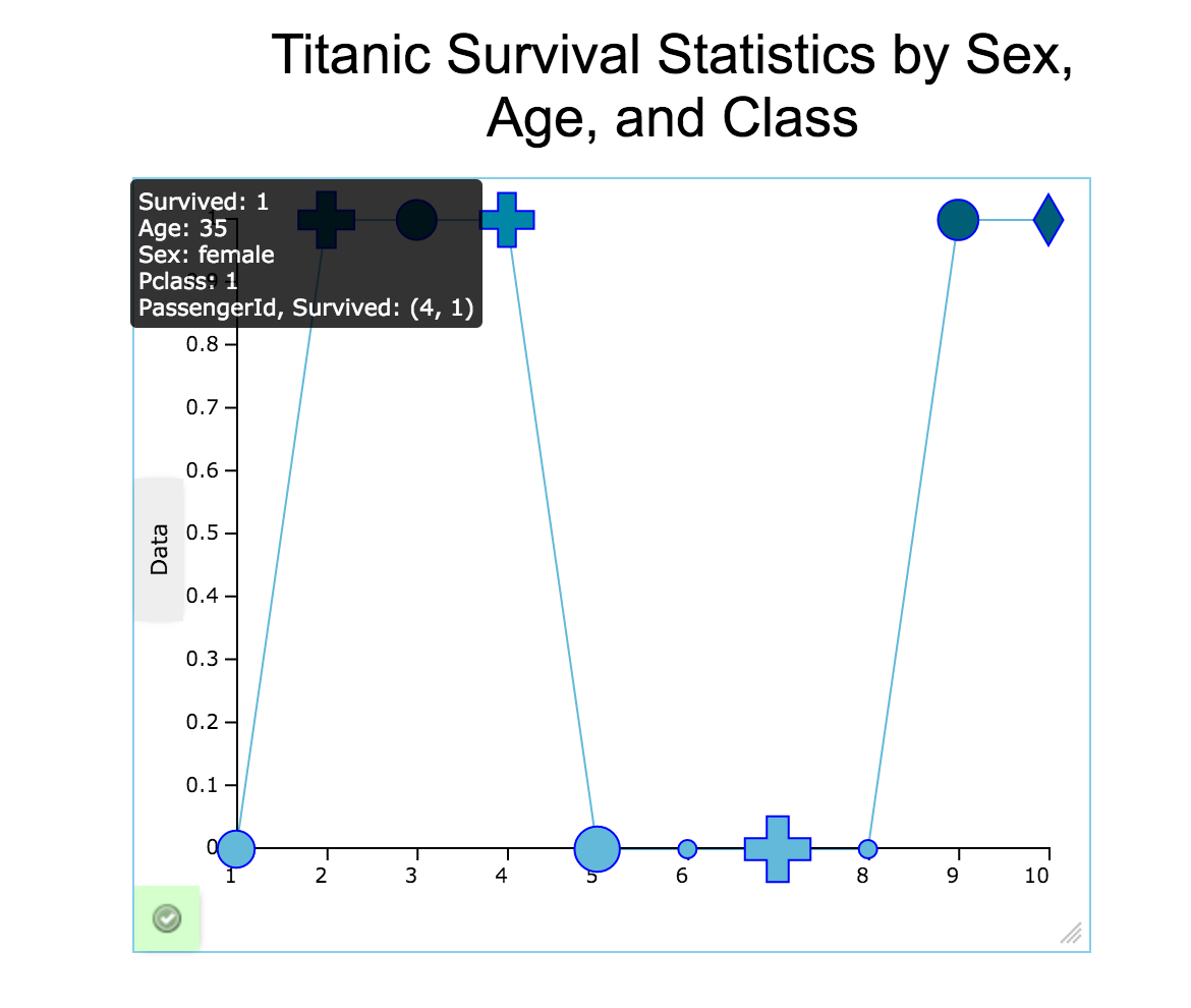
Categorical Bubble and Line Plot
Creates a bubble chart which is a variation of a line chart. The entities displayed on a bubble chart can be compared in terms of their size as well as their relative positions with respect to each numeric axis. Since both the x and y axes of the bubble chart are numeric scales, position is an indicator of two distinct numeric values. The area of the plot depends on the magnitude of a third numeric characteristic. Bubble charts can be used in project management to compare risk and reward among projects. They can facilitate the understanding of social, economic, medical, and other scientific relationships. You can think of them as performing a visual square-root transformation on the data set.
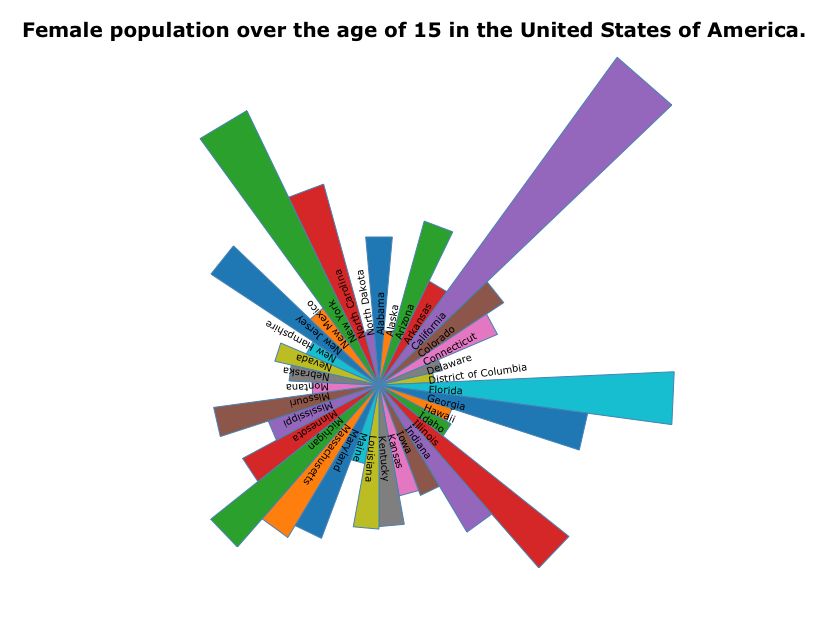
Polar Area Chart
Creates a polar area chart. The polar area chart uses bars of the same width extending from the middle of a circle and vary in length depending on data in each row.
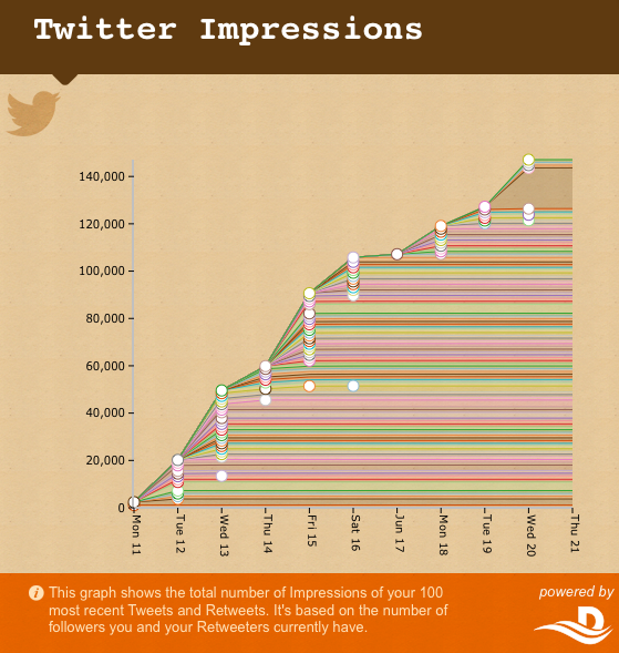
Time Series Chart
Creates a time series chart showing a time interval on the horizontal axis compared to a variable shown on the vertical axis.
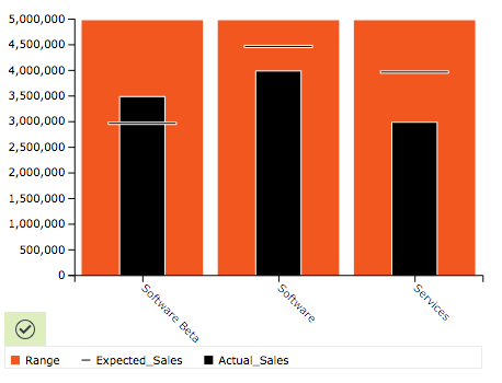
Bullet Chart
Creates bullet graph. A bullet graph is a type of bar graph and is mainly used for graphically visualizing performance data with relevant comparative data within a predetermined range. This is a very nice visual display when you are looking to show or gauge progress by showing the actual data value versus the goal that the actual data is trying to reach.
Multi Bar Chart
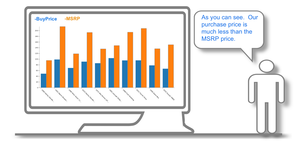
Creates a 2D or 3D bar or multi-series chart. Bar charts are used for plotting data which has discrete values and isn't continuous, or for tracking changes over time. Some examples of discontinuous data include political party seats each election, the pricing of a set of items, or the frequency of different categories. If you want to rank or compare values, you might want to use a bar chart.
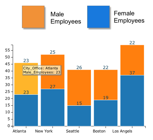
Stacked Bar Chart
Creates a stacked bar chart. Stacked bar charts are used to show different pieces of a whole and how those parts compare together. Stacked bar charts are also used to show the percentages of data in comparison to related data. The height of the combined stacked bars is the sum of the data.
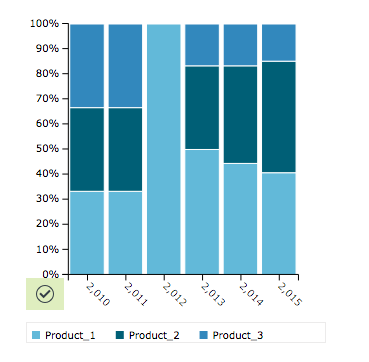
Percent Stacked Bar Chart
Creates a percent stacked bar chart. Percent stacked bar charts are a another subtype of bar chart that are used to show different pieces of a whole and how those parts compare together. Percent stacked bar charts are also used to show the percentages of data in comparison to related data. The height of the combined stacked bars is the sum of the data.
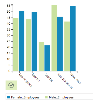
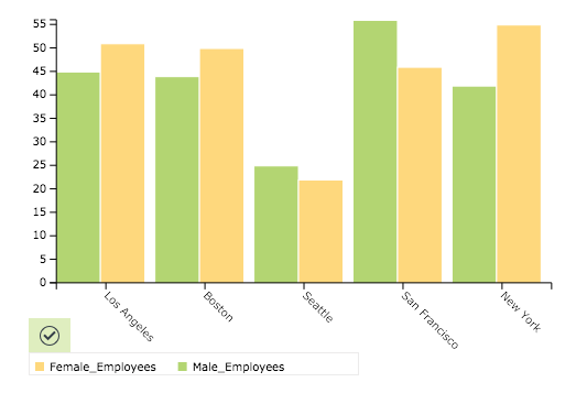
Grouped Bar Chart
Creates a 2D or 3D bar chart. Bar charts are used for plotting data which has discrete values and isn't continuous or for tracking changes over time. Some examples of discontinuous data include political party seats after an election, the pricing of a set of items, or the frequency of different categories. If you want to rank or compare values, you might want to use a bar chart.
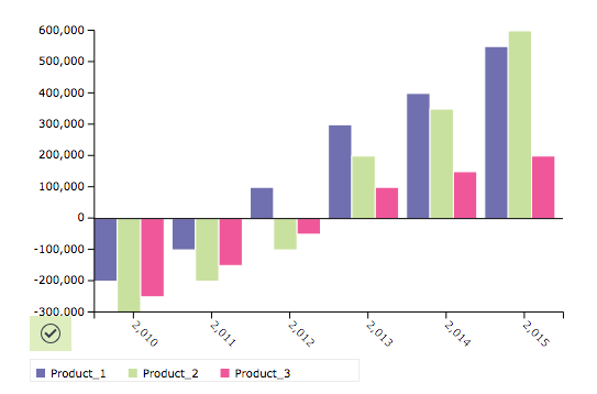
Negative Group Bar Chart
Creates a negative grouped bar chart. Negative grouped bar charts are used to how two values that are in the same group compare when negative values are found.
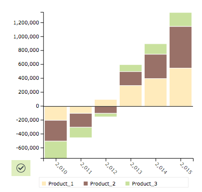
Negative Stacked Bar Chart
Creates a negative stacked bar chart. Negative stacked bar charts are used to how two values that are in the same group compare when negative values are found.
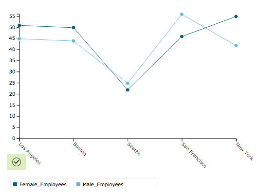
Line Chart
Creates a line chart. Line charts are used to track changes over periods of time, or relative change between different items. If you want look at trends such as growth, decline, or trends and more data points you might want to choose a line chart.
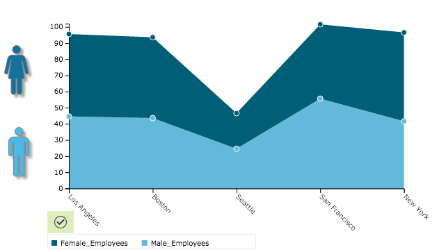
Area Chart
Creates an area chart. Area charts are used to track changes over periods of time, or relative change between different datasets. If you want look at trends such as growth, decline, or trends and more data points you might want to choose an area chart.
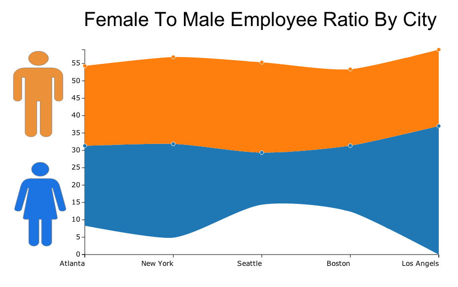
Stream Area Chart
Creates a stream area chart. For continuous data such as time series, a stream area chart can be used tin place of regular stacked bars/area charts. Stream area charts are a generalization of stacked area graphs where the baseline is free. By shifting the baseline, it is possible to minimize the change in slope in individual series, thereby making it easier to perceive the thickness of any given layer across the data.
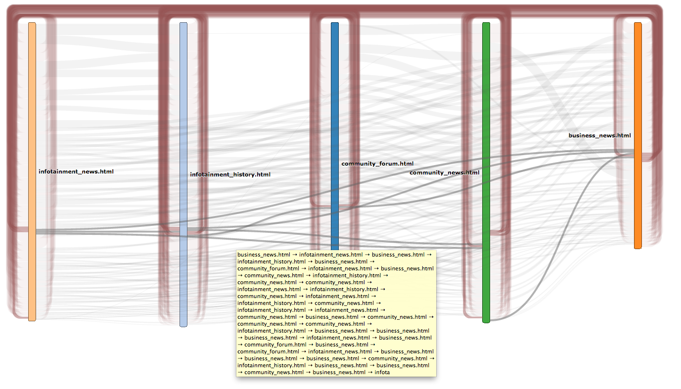
Sankey Diagram
The Sankey diagram displays a flow of how variables behave on a path from one set of values to another. Node is the given name of the different variables and a link is the name to a connection between nodes.
Text Widget
The text widget allows you to add text to your infographics for a more dynamic presentation.
Statistics Text
The statistics text widget allows you to calculate mathematical functions for your data to add to your infographics instantly.
Images
The image widget allows you to add images to your infographics for a more dynamic presentation.

Table with Data
Creates a table with data. You can use them to compare items for example, sales of a list of items by month and the sales volume or dollar value. They are also used for testing and analyzing outcomes on a large scale.
Shapes
The shape widgets allows you to add shapes to your infographics for a more dynamic presentation.