Map Widget
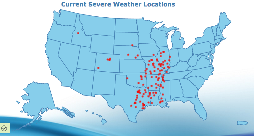
You can create a map chart which can be used to analyze data linked to a geographic location. For example, you could map earthquake data such as magnitude vs geographic location. It can be used for resource management, asset management, marketing, and other purposes. If you want to show data broken down by country, county, or state, use a map.
Configuring the Map
Here you can find out what kind of data can be represented as a map and what options you have to represent your data. General steps for configuring widgets are explained on the Visualizing Data page.
Data Requirements
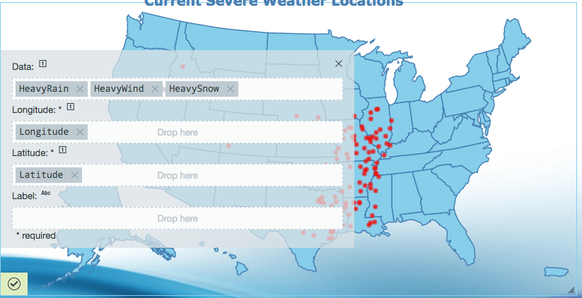
In order to represent data specific to a point on a map, you need the coordinates representing longitude and latitude. The coordinates must be either an integer or a float value. The optional data value you are representing is also a number. A label (string) can be applied as a descriptor to your data points.
Appearance-Specific Settings
The appearance of a map chart can be adjusted through standard and specific settings.
Standard widget settings give you basic controls in order to customize a widget. Learn more about standard widget settings here.
Specific widget settings give you more controls over details pertaining to the map chart widget. With these controls, you can adjust you widgets to create the perfect infographic to fit your needs.
Color
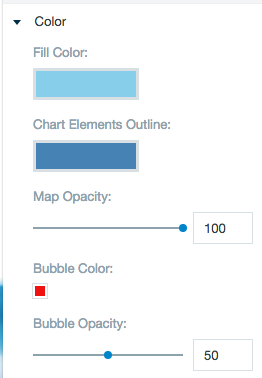
Color settings let you adjust the color aspects of the widget. The color bar represents the colors currently being used for the widget. Use the color wheel by clicking in a color box and selecting the color to add to that space.
The bubble opacity bar lets you adjust the opacity of the bubble points on the map.
Chart variant and style
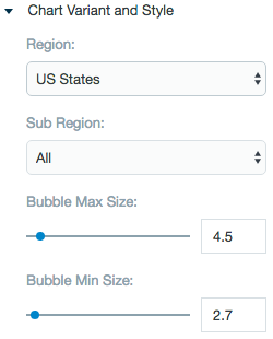
These settings let you choose which map to plot the data points on and the visibility of the bubble points.
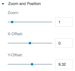
Zoom and position
These features give you the ability to zoom in and out as well as moving the widget left, right, up, and down.
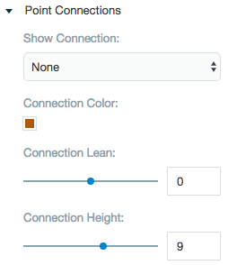
Point connections
Choose if the points on the map should connect and how the connections can be viewed.
The points on the map can be connected in 3 separate ways.
A) Along series: The first point in the data connects to the second, the second point in the data connects to the third,...
B) Between series: The first point from the first series of data connects to the first point of the second series of data, the second point from the first series of data connecst to the second point of the second series of data,...
C) Series spokes: The first entry in the data is connected to all the other entries in the data.
Formatting
Formatting settings give you controls to added pre/suffix to labels, and ability to add in a thousands separator for data.
