Sunburst Chart
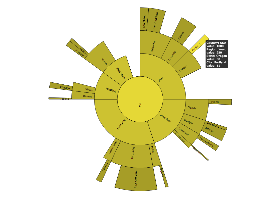
A sunburst chart shows the hierarchical nature of a dataset. These charts are a variant of classical level-link diagrams. The root level is located in the center, the position of levels compared to each other shows their rank in the structure's hierarchy, and the size of each level is determined by its weight (a value present in the workbook chosen by you).
Configuring the Sunburst Chart
Here you can find out which kind of data can be represented as a sunburst chart and what options you have to represent your data. General steps for configuring widgets are explained on the Visualizing Data page.
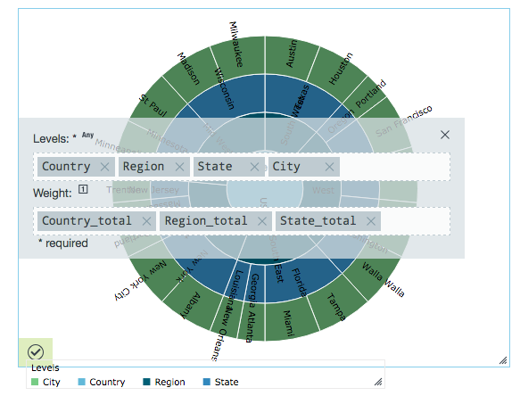
In the Levels field, you can enter different types of data. The sunburst chart aggregates duplicate data and resizes each portion of the chart depending on those aggregates. Whichever value is added first is represented in the center of the widget. Additional values are added to the next level of the chart in that order. In the example below, Country is the center of the circle and each of the next values represents another level extending outward. City was added last and is the outmost level.
In the Weight field, you can use numeric values to change the size of each slice of the chart at a given level. All the weights that correspond to a specific segment of a level must have the same numerical value. In the following example, all rows containing Wisconsin must have the same State_total value to be used as a weight. and all of the combined weights for a particular level of a chart must be of equal or lesser value than the value of its parent level. For example, the weight values for Wisconsin and Minnesota combined must be less than or equal to the weight value for Midwest.
Data Requirements
The different nodes can be made up of any type of Datameer X supported data. But the weight applied to the data must be a number. Note that if two or more workbook rows are the same, then these non-unique rows aren't shown in the sunburst chart.
Appearance-Specific Settings
The appearance of a sunburst chart can be adjusted through standard and specific settings.
Standard widget settings give you basic controls in order to customize a widget. Learn more about standard widget settings here.
Specific widget settings give you more controls over details pertaining to the sun chart widget. With these controls, you can adjust your widgets to create the perfect infographic to fit your needs.
Legend
Legends can be shown or hidden. All legends move along with the parent widget, but they can be independently moved if separately selected.
Color
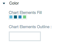
Color settings let you adjust the color aspects of the widget. The top color bar represents the colors currently being used for the widget. Use the color wheel by clicking in a color box and selecting the color to add to that space.
Label style
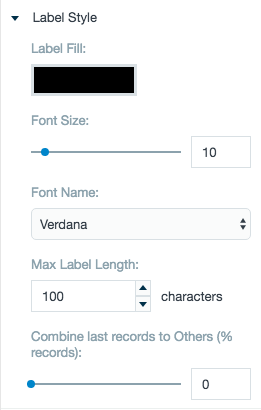
The label settings give you controls to adjust how labels are displayed on the widget. you can control the size and type of fonts as well how they are viewed.
Chart variant and style
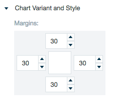
Chart style settings give options to adjust widget positioning. Use the margin adjuster to perfectly position the widget within the frame.
Formatting
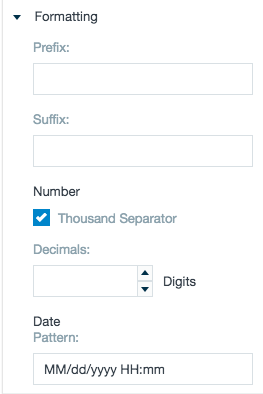
Formatting settings give you controls to added pre/suffix to labels, add in a thousands separator and number of decimal places for data, and adjust how the date can be displayed.
